

Heat maps are a visualization where marks on a chart are represented as colors. As the marks “heat up” due to their higher values or density of records, more intense color is displayed. These colors can be displayed in a matrix/crosstab, which creates a highlight table but can also be displayed on a geographical map or even a customized image—such as a web page used to show where users are clicking.
Density plots are coming in Tableau version 11, but in the meantime, heat maps are defined somewhat differently in Tableau. This chapter shares how to create a Tableau heat map.

- Advertisement -
To first get more specific about how Tableau defines heat map, let’s take a look at the requirements to draw a heat map under Tableau’s Show Me options:
“For heat maps try 1 or more dimensions and 1 or 2 measures”
This is very close to the requirements for drawing a highlight table with Show Me:
“For highlight tables try 1 or more dimensions and 1 measure”
The key distinction between the two chart types is that with a heat map, you can encode the marks by one additional measure. With a highlight table, your only option is to color the marks by one measure.
Since you can only color marks by one thing at a time, your encoding is limited to exactly one measure. With a heat map in Tableau, you can color the marks by one measure, but also size the marks by a second measure. Depending on your analysis, this additional encoding can add value to your visualization.
How to Make a Heat Map in Tableau
Let’s say we’ve been tasked with evaluating the product sub-category sales in the Sample – Superstore dataset by Month of Order Date to see if we can identify any seasonal trends in the data. The element of time (Month of Order Date) may give you the instinct to go with a line graph for this analysis, which would look like this:
HEAT MAP IN TABLEAUAs you can see, this graph is a bit of a mess. The 17 lines are causing a lot of overlap and several of the sub-categories at the bottom are on a much smaller scale than the rest, making it challenging to gain insights. In this case, a heat map may be a better option.
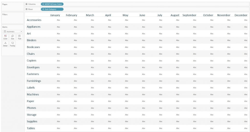
To create a heat map in Tableau, start by laying out the rows and columns that will serve as the grid for the visualization. I would like the months in this analysis to be listed along the top of the view. Since the months will create columns, I know that I should put the Month of Order Date dimension on the Columns Shelf. Conversely, I would like each sub-category to have its row, so I will place that dimension on the Rows Shelf:
By default, the mark type is set to Text. I prefer my Tableau heat maps to be created with circles, so I will change the mark type to Circle to lay the foundation for the view. The Shape or Square mark types are also good choices:
Now that I have a mark at each intersection of Sub-Category and Month of Order Date, I can encode them by two measures; one that will determine the size of the marks and one that will determine the color intensity of the marks. This encoding is produced by placing the measures we want to encode the marks by onto the Size Marks Card and Color Marks Card, respectively. For my first analysis, I will size and color the circles by the same measure—Sales:

When the Sales measure—which always has a positive value—is used for color, we get a sequential color palette by default. If you were to place a measure such as Profit— which has both negative and positive values—on the Color Marks Card, you would see a diverging color palette by default with 0 at the center.
This visualization uses the same fields as the line graph from before, but it is now much easier to compare sub-categories within a specific month (reading the chart vertically) or compare the seasonality across each sub-category (reading the chart horizontally). The “double-encoding,” where the size and color are both based on the same field, are meant to help the insights “pop.” However, you have the option to use one measure for the size, and a different measure for the color. For example, here is what the heat map looks like if I size the circles by the Quantity measure instead of Sales:
With this analysis, large and light circles would mean that a sub-category sold a relatively large quantity but made a relatively low amount of revenue: low sales per item. Conversely, small and dark circles would mean the sub-category sold a relatively small quantity but generated a relatively high revenue:
high sales per item. Beware that this type of mixed encoding can be confusing for end users unless you explicitly state what the size and color represents. get more info Learn tableau from onlineitguru.com
Despite some of their limitations, Tableau heat maps provide a viable alternative to a line graph or highlight table if you need to compare dimension members with varying scales across multiple measures.
Article Source: http://ajfasy.com/tableau-heat-map-geographical
Comments are closed, but trackbacks and pingbacks are open.